Competition Management Platform for a Padel League
Client
PadelBox
Year
2025
Working at
AppX Digital
Overview
The new feature was the right excuse. The problem was the app around it.
Why it matters — an assistant inside an app that's hard to navigate doesn't fix the problem. It gives it a second door.
Product Designer, end-to-end on the player app redesign · AppX Digital
Navigable prototype with real scroll and expansion
Implemented
The decision I'd defend — the interface answers what's predictable; the assistant answers what's variable.
Where it's headed
What the redesign defines
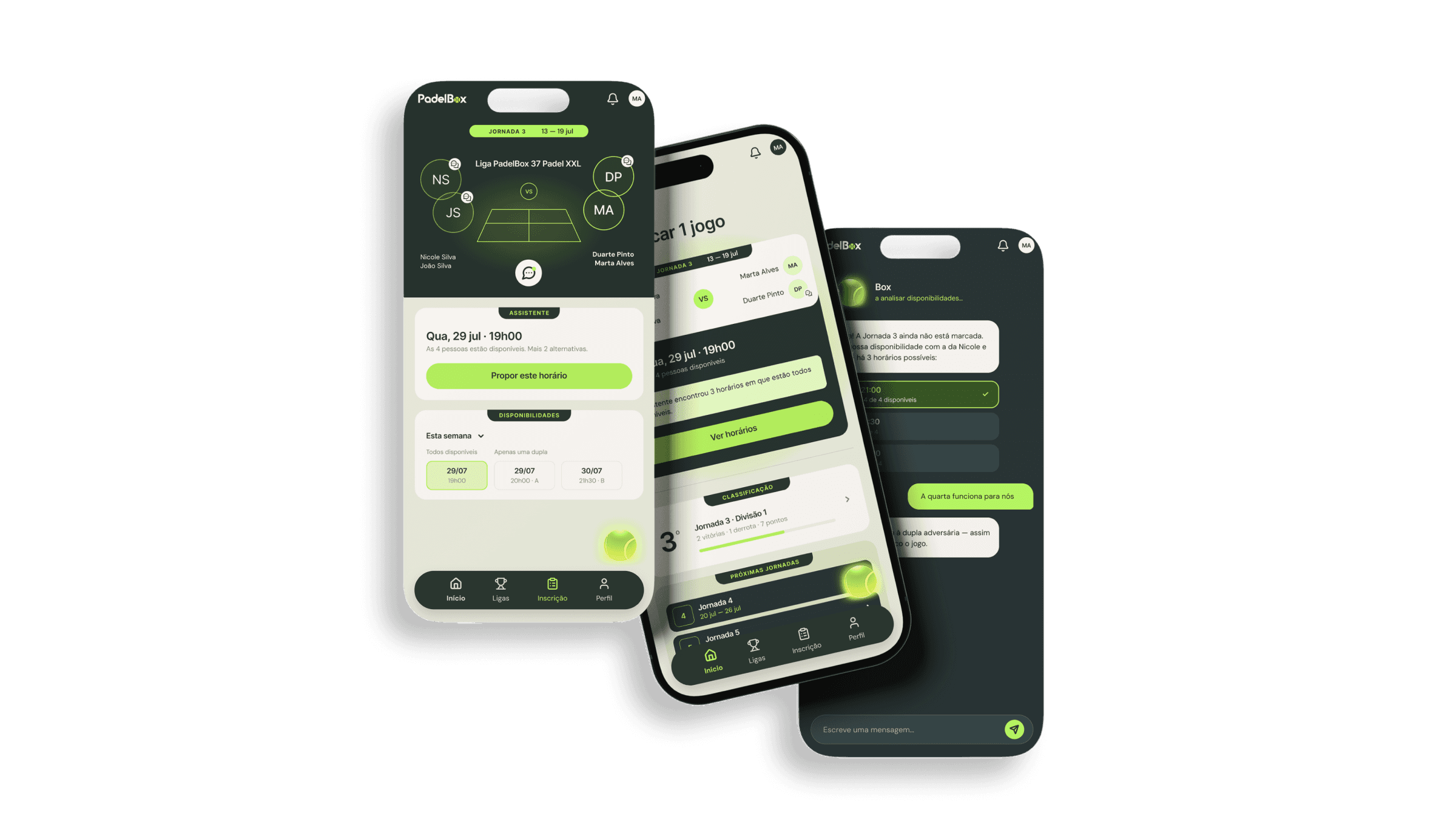
The redesign was designed screen by screen, with states and a navigable prototype. What it established was a hierarchy: four fixed destinations, the league as explicit context, and an assistant that only enters where the interface doesn't reach on its own.
If the assistant gets heavy use for things that are two taps away, the navigation still isn't solved. That's the first thing I'd look at.
Thanks to the AppX Digital team and to PadelBox, who argued about every screen instead of approving them.
The Problem
PadelBox runs social doubles leagues: fifteen regional leagues, going since 2013. Pairs enrol, receive a draw, and arrange each match themselves. The app is the infrastructure of a competition people run among themselves, opened in bursts to arrange a match, enter a result or check a standing. Everything lives inside a league, and a player can be in several at once, plus past editions.
The ask was a feature. The work was architecture.
In an app that's hard to navigate, most questions an AI assistant receives are ones the interface should have answered. A chat that exists because navigation failed only patches it.
The real competitor isn't Playtomic. It's the WhatsApp group. It's unbeatable at arranging matches, so we differentiated on what it can't answer: what position am I in, who's left to play, how long do I have to book.
My Role
Product Designer at AppX Digital, end-to-end on the player app redesign: navigation architecture, screen and state model, high-fidelity UI, and a prototype with real scroll and expansion. The app already existed: it had users and a live season, so every new screen needed an equivalent in the existing app or an explicit reason not to have one.
Replacing the side menu with a bottom bar was decided with the team on my recommendation. It also caused the project's biggest problem, which is in Learnings.

The System
The league is a context, not a menu item.
Everything is scoped to the league you're in.
The side menu was doing two jobs. It navigated between sections and switched the active league. Because both lived in the same place, they looked like one function. They aren't: one takes you somewhere else, the other changes the meaning of everywhere.
The app is used in bursts, not sessions. A menu charges a tap on every short visit.

Decisions
Four fixed destinations, always visible. The tasks are few, frequent and short. A fixed bar shows the whole map and your position with no tap at all.
The league became a place. Active, Upcoming and Past leagues, each with its count visible before opening.
Cards expand in place. Comparing leagues is the task, and a modal would hide what's behind it.
History treated with the same care as the present. Past standings and matches, with the player's own row highlighted.
The assistant answers what's left: regulations, exceptions, and anything requiring a cross-reference.
AI enters where navigation doesn't reach.


Trade-offs
Side menu → bottom bar with four destinations.
Costs: four is a ceiling, and the app will grow. Watch: whether the first new feature asks for a fifth icon.
If it does, the answer is revisiting the hierarchy, not adding an icon.
Assistant as the way in → interface for the predictable, AI for the variable.
Costs: the feature is less visible than the investment in it. Watch: whether conversations are about things the interface couldn't answer.
Modals → cards that expand in place.
Costs: long pages. Watch: whether the list outgrows expansion.
Every stats column → four visible, the rest on horizontal scroll.
Costs: hidden stats. Watch: whether standings still read at a glance.

Testing & Metrics
A remote usability test with five players (two with league experience, three without) on the interactive prototype, across four tasks.
Find your next match — 5/5, average 2.2 taps. Nobody opened the assistant.
Switch leagues — the most friction: 3/5 without help. 2/5, both new to leagues, looked for the second league inside the current league's content.
Find a past league — 5/5, average 3.6 taps. History was recognised as part of the product.
Your partner can't play. Where do you go? — 5/5 opened the assistant, which is exactly the intended boundary.
What changed: the bottom bar held up. The league selector was still competing with the league as a destination, so I'd keep the four destinations but make the active league explicit and persistent.
Still to instrument (not measured yet)
Hypothesis — predictable answers moved into the interface.
Metric — % of assistant conversations about things already two taps away; above roughly a third, the chat is covering for navigation.
Hypothesis — matches move from WhatsApp into the app.
Metric — share of matches arranged in-app.

Learnings & What's still open
A new feature is a good reason to look at the whole house. Adding an assistant to navigation that fails only institutionalises the failure.
Removing something is harder than replacing it. The menu's second job, switching the active league, disappeared with it. The fix took three attempts: blocks inside the screen, then a dropdown, then a dedicated screen with expanding cards. The mistake was treating one element as if it had one function.
The decision that most needed testing is the one I tested, and it struggled. The bar held up (5/5 on the next match, 5/5 on history), but league switching lost the two players new to the format. The model was coherent on paper; players showed where it wasn't legible yet.
Still open: the four-destination ceiling is untested against real growth. The league-switching fix is untested; only the problem is confirmed. The assistant's scope only holds if the interface covers the predictable in production.