Conversion and Subscription Management
Client
Gaia Goddess
Year
2025
Working at
Plus972

Overview
People were leaving at the three moments that asked them to commit.
Why it matters — in a subscription, the product is sold three times: when someone chooses a plan, when they confirm it, and every month they decide to stay.
Product Designer, end-to-end · engaged by Plus972
Full membership flow, functional prototype, documented handoff
Tested with 8 people · no live analytics yet
The decision I'd defend — reassurance always comes before commitment.
Where it's headed
Hypotheses written, data still to collect
The membership flow was designed end to end around a single principle. Eight people tested it and the principle held: seven of eight could say what they'd be charged and when, before they were asked to pay. The unfinished part is that the billing line is understood by people who read, and still missable by people who scan. The next iteration makes the existing billing line harder to miss.
Thanks to Plus972 and the Gaia Goddess team, for treating subscription management as part of the product rather than the page you hide.

The Problem
Gaia Goddess is a wellness membership platform: a content library, practitioners, retreats and workshops, with three plans and a seven-day trial. All three selling moments failed, each one differently.
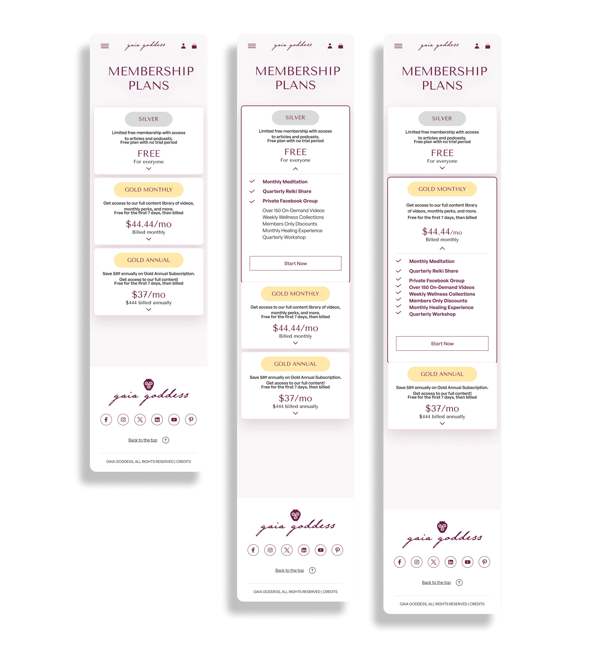
Plans page: three similar options at similar prices, and people left without choosing.
Sign-up: nothing said the account already existed and the process was recoverable, so people treated the email confirmation step as the end.
A step of progress was being experienced as an ending.
Subscription management: a platform update had left the member area out of sync with what people had signed up for.
A constraint from the start: there was no design system, so the existing components were audited before any screen. I didn't benchmark wellness platforms. The problem was a subscription problem, so we matched subscription conventions and differentiated on treating management as part of the product.
My Role
End-to-end Product Designer, engaged by Plus972: research synthesis, information architecture, wireframes, high-fidelity UI, an interactive prototype covering three sign-up paths and every management action, and handoff. I ran a dedicated handoff session because one component renders differently when the plan is the user's own.
That's an interface decision with a direct front-end consequence, and I flagged it rather than letting it be discovered later.
The System
Three decision moments, one principle: reassurance comes before commitment.
People abandon because the interface doesn't answer the question they have at the moment they have it. The research said this four ways: the information existed, but it arrived late.
Trial terms belong before the payment screen, not on it. A plans page needs one clear reason to act, not a full comparison. A plan change needs three answers before confirming: what changes, when, and what happens to billing.


Decisions
Plans that show the difference. Visual hierarchy weights what's new in each tier. Muted items read as not in this tier rather than unavailable, through copy and icons rather than colour.
A confirmation that says where you are: account created, waiting for confirmation, recoverable.
The step didn't change. What it communicates did.
Know where you are before deciding where to go. The active plan loses its button and gains a Current Membership label, while the others show the explicit action (Change to Silver). It costs a three-state conditional component.
Billing before the choice. Trial terms and billing implications appear before the plan is chosen, not on the confirm button.
Pausing as a real alternative to cancelling. Members can suspend for 30 to 90 days, seeing what they lose and what they keep. It gives members an option that didn't exist. Those who do cancel say why.
Trade-offs
Equal weight for every feature → hierarchy per tier.
Costs: more careful component design. Watch: differentiation ever relying on colour alone.
Standard confirmation page → progress-aware page.
Costs: more copy and states. Watch: whether drop-off at that step actually moves.
Let people infer their plan → explicit indicator.
Costs: a three-state component with front-end logic. Watch: the states staying distinct as plans change.
Design first → audit existing components first.
Costs: delays visible work. Watch: whether the new flows add to the fragmentation instead of reducing it.

Testing & Metrics
Usability test with 8 participants · product analytics not yet instrumented.
A remote, unmoderated test with eight people who had paid for at least one subscription service, across four tasks.
Choose a plan and explain why — 6/8 decided from the highlighted differences; 2/8 read most of the feature list first.
Before paying: when will you be charged, and how much? — 7/8 correct without scrolling back. One knew about the trial but not when the first payment would land.
Stop for two months — 6/8 found pause before cancel; the other two headed for cancel, then noticed pause before confirming.
On confirmation: what just happened? — 7/8 understood the account existed but still needed confirming.
What changed: the principle held. The weakness is that billing can still be missed by people who scan, so the next iteration makes the existing line harder to miss.
Still to instrument (once live)
Hypothesis — current-plan visibility reduces decision time.
Metric — time from page load to Change Your Membership Type.
Hypothesis — billing information before the choice reduces abandonment.
Metric — confirmation completion rate, in an A/B test.
Hypothesis — pause captures people who'd otherwise leave.
Metric — % of pause users resuming within 90 days; below roughly a third, pause is delaying churn, not preventing it.

Learnings & What's still open
Measurement is design-phase work. I left the project with hypotheses and no instrumentation. The usability test only exists because I went back for it.
The plans page was a matter of orientation. People needed to understand what they were choosing, and most participants never read the full feature list.
An interface decision can be an architecture decision. The active-plan label looked cosmetic; unnoticed, it would have surfaced as a bug three weeks later.
Still open: eight people understanding the billing line isn't conversion. The component audit fixed this scope, but the rest of the platform still has no design system. And pause's failure mode, delaying churn, looks like success on a monthly chart.

